KEI-GO! devlog 1
[game design] [KEI-GO!]
Table of Contents
Card redesign idea
Today I came up with a big (possibly great) idea to change the direction of the games art.
I was thinking about Question Quest in relation to the design of KEI-GO! Without going into how the game works (I’m sure you can figure that out on your own…) on the cards in this game, there is a usage example for the grammar point at the top of each card.
Now, in KEI-GO! what is the hardest part of the game? --> Making questions.
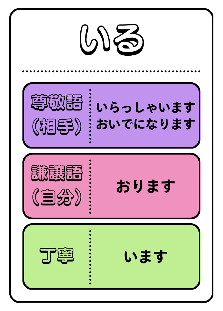
What’s easiest? --> Using 丁寧語 because it’s just the ます version of verbs, which I’m sure ANYONE in our target audience that plays the game will know how to formulate.
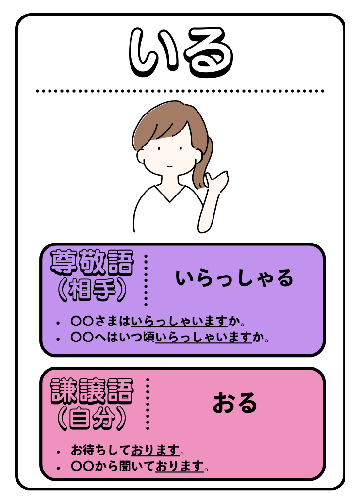
So, big design decision – do we remove the 丁寧語 part of the card and put in some usage examples instead? This would aid the player in forming questions, and give correct usage examples, supporting and scaffolding their use of Keigo.
I’m playing with a redesign of the cards based on this idea.
Mock ups:
 Initial design
 Updated design with example sentences